11/1/16

Guernica (english version)

Author: Pablo Ruiz Picasso
Creation: 1937
Location: Queen Sofía National Museum, Madrid (Spain)
Technique: Oil on canvas
Dimensions: 349,3 x 776,6 cm

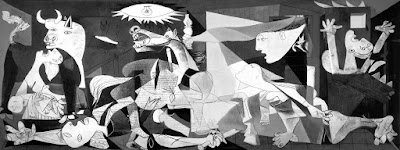
Guernica

Contextualization and theme


It is about a large dimensions painting made in 1937 by Pablo Picasso for the Republic pavilion in the Universal Exhibition of Paris the same year. After a lot of years placed in EEUU, it arrived to Spain being placed permanently in the Queen Sofia Museum.

The theme revolves around the war horrors. Picasso, facing the Spanish Republic order, which was immersed in the middle of the Civil War after the military rebellion, was shocked by news about the Basque city bombing of Guernica. The news were headline in all the newspapers that highlight the brutality of the action applied over a small city without military interest, disarmed and only occupied by civil population. With this leitmotiv, he begins to build the great canvas.

Through many notes and several versions of the complete painting, Picasso, little by little, is started opting for bombing specific motifs to concentrate all the violence over emblems and figures that stop referring to the specific incident. In this process, Guernica stop being a pure historic painting to turn into a shout against war from the point of view of the victims, a reflection about destruction and pain applicable to any type of conflict, changing a specific incident in a universal work, understandable without necessity of knowing the specific details. 

Characters´s symbolic interpretation


Regarding the represented characters, all of them are victims, without any soldier appearance. Its interpretation has been very questioned, being refused reiteratedly by the painter to give them a specific meaning.

The bull: reading the painting from left to right and from top to bottom the first figure with which we find is the bull. It is a recurrent symbol in Picasso´s works and, in this case, normally it is assimilated as a self-portrait. It is interpreted as the author horrified by such atrocity, with a knife shape ears listening the pain shouts and protecting the mother´s figure who is positioned just under him. So the bull is him, the same Picasso, the necessary witness to cry out for world about the war brutality.

The mother with her son: just under the bull it is found, protected by this animal, the figure of the mother who holds his dead son. This figure, as many of you have deduced, in the same way as the composition, is classical as well: The Pietà, symbol of mother´s pain per excellence.   

The mother with her son detail
In this composition it is very important the characters’ heads. On one hand, child´s head, dramatically fallen and rolled child´s eyes without pupils, makes us guess he is dead. On the other hand, the mother, whose head´s position makes us guess she is looking for the impossible relief of heaven, or even the animal. Her eyes, very important for this character, have a tear shape, another more symbol of woman´s distress, besides the sharp tongue that introduces a dying pain scream in our minds.  

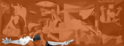
The warrior: drawing the triangle base of the composition it is found the dead warrior at the bottom of the painting. In the initials sketches this character was represented as a great classical hero, with his Hellenic helmet and the spear close to his body, but in the final project that idea was rejected. In this way it is transmitted that idea of characters´ vulnerability, representing that the city was defenceless against the cruel attack.

Warrior stigmas details
Besides, other important references to classicism in this work are the stigmas that are represented in many of the hands that appear in the work. Inevitably the reclining bodies are related with Jesus Christ´s body to change the great Christian warrior captures, Francisco Franco.    

But there is even more another symbol, classical as well, though, in this time, modernised by the shape how it is represented. It is about the ascending arrow that is found close to the warrior, symbolising his soul´s Ascension to heaven.

Arrow detail
The lights: paying attention to the painting general composition another time, it is seen perfectly how both spotlights are at the peak of the pyramidal hierarchy. And it is that both spotlights represent both big powers and Spanish Civil War sides. On one side, the enormous lamp is introduced to us as a big controlling eye that can see all and want to dominate all. Just to its side, a small oil lamp strongly grabbed by a civilian´s beautiful and muscular arm that makes his way facing the disaster. In this way it is presented to us a duality, the Civil War duality, good and evil duality.     

Apart from the objects, the fact of dealing with the spotlights gives us cause for analysing the light itself. During a large part of the History of Art the light has been a beauty, strength, honour bearer. In this painting, by the contrary, it is introduced to us the light as an exterminating object, as the tool that is used to the night slaughter. 

Republic detail
Referred to the oil lamp bearer character, many experts agree with the fact that it is an allegorical figure of the Republic that, devastated by all that its eyes is seeing, is taken its hand to its chest, a universal patriotic symbol.  

The horse: it is about the painting main object, optically talking due to its location and size inside the work. In this one it is perceived a big rhomboid wound, with an extreme contrast between black and white colours, emphasising in this way the horrors and brutality of the situation. Besides the author places in the animal a spear that go through him mortally, an engraved symbol in his mind – in the same way that the bull – thanks to a bullfight the author attended in his visit to Spain in 1934.

Horse detail
Another essential detail to understand in a good way the painting is hidden in the texture that Picasso and Dora, his second lover, gave to the animal body. If we observe the combination, we can realize how that texture favours that the horse body is dissolved in a sea of newspapers letters. The marks are illegible but above them it is the head that dominates all the things, the force of the Art makes its way between the news buzz.

The lame woman: this woman, who seems to try to scape of that situation, is gone towards the light although she seems to be paralysed by the horror that this one lights up. From this figure stands out the left leg that many critics consider already dead, by the colour it has in comparison with the other leg of the same figure. Her arm seems to place in that lower extremity to cover a possible haemorrhage. Another time, another figurative character related to another war horror: the attempt of survivors´ scape.

The man (woman?) in flames: this character, represented to the left of the painting, represents, for many, the Guernica citizens who died because of incendiaries bombs rain that finished destroying the settlement. This person, placed as the main character of the executions by firing squad in 1808, the 3rd of May painted by Francisco de Goya, raises his arms to the heaven as begging to the relentless air force that stops bombing the city.

Pigeon detail
The pigeon: in the middle of this horrible chaos the artist decides to put a small and almost indistinguishable reference to peace: a pigeon. It would be possible to wait that this one could have an essential role in the painting or, at least, a pure white colour, but it doesn´t. The artist represents in this way the broken, dirty and murdered peace of the people by the Italian-German troops. A peace that, jointly the represented characters, seems to exclaim to heaven that the violence stops.
Hope detail
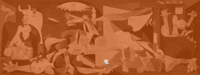
The flower: in the Guernica initials sketches, Picasso shows quite more hope symbols that the timid represented flower at last. He starts with a raised fist, with Pegasus emerging from the horse wound… but he finishes with a simple and humble flower.
Flower detail
Why does hope finish repressed in that tiny flower? Because Picasso doesn´t represent the Spanish nation´s resurrection, he doesn´t represent the hope of getting a better world, Picasso represents his own version of Goya´s War Disasters. Here there is no hope, there is only space to brutality and despair. This is war. This is Art.

Compositional organization and drawing technique


The composition reminds the triptych compositions, divided in three areas. The central one is ordered in a triangular shape around the horse, including in its low area the statue and the woman who moves forward. To both sides of this central group it is created two rectangular triangles that are balanced out in their figures. Everything that has been said confirms us a strong scene study, looking for a clear organization and based in a well-delimited areas that permit a better scene comprehension, thought to its exhibition in the presence of a non-understood audience.    

Guernica triptych

Guernica triangles

The drawing takes part in these techniques renovation explained previously. Over it we can discover Picasso´s previous experiences, as cubism. Departing from the idea of negation referred to the unique point of view, the figures are studied from several places, joining after that the different visions in a more complex image (because it provides with more information) though in a different way in relation to the usual one (simultaneous vision). In this manner, the bull has both eyes at the same level or the different anatomical parts of the horse belong to opposite point of views (see the head).

Beside this technique is observed other typical references to contemporary representation. In certain places it can be appreciated the figures deformation that Picasso makes to give them more expressivity, as it happens with the horse head, the woman´s enlarged hands who hold her dead son or the woman´s on the right deformed legs. In the same way, it is produced objects attributes transfers, making into one´s another, just like it happens in the tongues that are made into sharp objects, like knifes, or in the extreme women´s eyes where the eyes have been made into their own tears.  

These two last features leave from surrealism world which Picasso frequents at the end of the twenties and in the thirties. His expressive liberty idea is patent as well in certain suggestions from the children´s drawing that appears in the painting and the painter was discovering in that moments. From that experience (the children´s drawing doesn´t draw things as it sees but as it knows) he reduces some elements to its pure visual essence, giving enough data so that the image, without being a copy from reality, was understandable, just like it happens in the statue flower or the bulb drawing.

Colour, light and space


The colour and the light work in a joint way. From the first moment, Picasso thought in the painting as a black and white image that, in its chromatic limitation, could transmit all the atmosphere of pain and tragedy. Over this background, the characters´ dramatic expressions put on hold, as terrifying shouts inside a general silence in which the pain absence collaborates, though not the tones, because the grey colour, in different gradations, calms and gives cohesion to the black and white sharp contrasts (see the horse head).

Referred to the light, already disassociated from reality naturalist recreation (classical chiaroscuro), it lights up the scene without obeying any spotlight type. It is about an unnatural light that is useful, above all, to guide us into the painting creating effects that emphasize the drawing (the hand that carries the oil lamp crossed by different shadows or the shadow effect shined by the statue hand) or the tragedy (the window strongly lighted up in the left side, too small to be able to leave the fire). In general, the main characters appear strongly lighted up, without shadows that emphasize their two-dimensionality.  

The space, over all at the beginning, can seem difficult to understand. Its strangeness is produced by the perspective disappearance, typical from Renaissance. From the first cubist experiences the idea of the painting as a window disappears. No longer it is expected the real representation of the world, and the canvas is turned into a two-dimensional space that renounce to the background, giving us all the images in the same level. No longer it is turned to the trick of doing things smaller dependent on the distance to the spectator and, in the same way, it is eliminated the chiaroscuro that modelled the shapes. Just in any places (statue neck, horse head…) it is preserved a certain traditional representation that is still good to facilitate the images lecture.  


5/1/16

El Guernica

Autor: Pablo Ruiz Picasso
Creación: 1937
Ubicación: Museo Nacional Centro de Arte Reina Sofía, Madrid (España)
Técnica: Óleo sobre lienzo
Dimensiones: 349,3 x 776,6 cm

El Guernica

Contextualización y temática


Cuadro de grandes dimensiones realizado en 1937 por Pablo Picasso para el pabellón de la República española en la Exposición Universal de París de ese mismo año. Tras muchos años en depósito en Estados Unidos, llegó a España, instalándose definitivamente en el Museo Reina Sofía.

El tema gira en torno a los horrores de la guerra. Picasso, frente al encargo de la República española, inmersa en plena guerra civil después del alzamiento militar, se ve conmocionado por las noticias del bombardeo de la ciudad vasca de Guernica. La noticia fue titular en todos los periódicos que destacaban la brutalidad de la acción, ejercida sobre una pequeña ciudad sin interés militar, desarmada y tan sólo ocupada por población civil. Sobre este motivo, comienza a construir el gran lienzo.

A través de numerosos apuntes y varias versiones del cuadro completo, Picasso poco a poco va decantando los motivos concretos del bombardeo para ir concentrando toda la violencia en símbolos y figuras que dejan de remitirse al hecho concreto. En este proceso, Guernica deja de ser un puro cuadro histórico para convertirse en un grito contra la guerra desde el punto de vista de la víctimas, una reflexión sobre la destrucción y el dolor aplicable a cualquier tipo de conflicto, convirtiendo un hecho concreto en una obra universal, comprensible sin necesidad de conocer los detalles concretos.

Interpretación simbólica de los personajes


En cuanto a los personajes representados, son todos ellos víctimas, sin la aparición de ningún soldado. Su interpretación ha sido muy cuestionada, negándose reiterativamente el pintor a darles un significado concreto.

El toro: leyendo el cuadro de izquierda a derecha y de arriba abajo la primera figura con la que nos encontramos es el toro. Es un símbolo recurrente en las obras de Picasso, y en este caso normalmente se asimila como un autorretrato. Se interpreta como el autor horrorizado al ver tal atrocidad, con unas orejas en forma de puntas de cuchillo escuchando los gritos de dolor y protegiendo a la figura de la madre que se sitúa justo debajo de él. Así que el toro es él, el propio Picasso, el testigo necesario para clamar al mundo la brutalidad de la guerra.

El toro de El Guernica

 La madre con el hijo: justo debajo del toro se encuentra, resguardada por el animal, la figura de la madre que sostiene a su hijo muerto. Esta figura, como muchos habréis adivinado, al igual que la composición, también es clásica: La Pietà, el símbolo del dolor de una madre por antonomasia.

En esta composición son muy importantes las cabezas de dichos personajes. Por un lado, la del niño, que con la cabeza dramáticamente caída y los ojos en blanco, sin pupila, nos hace adivinar que está muerto. Por otro, la madre, cuya posición de la cabeza nos sugiere que busca el consuelo imposible del cielo, o incluso del animal. Sus ojos, muy importantes para este personaje, tienen forma de lágrima, otro símbolo más del desconsuelo de la mujer, además de la punzante lengua que imprime en nuestras mentes un agonizante chillido de dolor.

La Madre con el Hijo de El Guernica

 El guerrero: dibujando la base del triángulo compositivo se encuentra en la parte baja del cuadro el guerrero muerto. En los bocetos iniciales este personaje era representado como un gran héroe clásico, con su casco helénico y la lanza junto a su cuerpo, pero en el proyecto final se rechazó tal idea. De este modo se transmite esa idea de vulnerabilidad de los personajes, de representar que la ciudad estaba indefensa contra el cruel ataque.

Además, otra referencia al clasicismo bastante importante en esta obra son los estigmas que se representan en muchas de las manos que aparecen en la obra. Inevitablemente se relacionan los cuerpos yacentes con los de Jesucristo, para así cambiar las tornas del gran guerrero cristiano, Francisco Franco.

Pero aún hay otro símbolo más, también clásico, aunque esta vez modernizado por la forma cómo se representa. Se trata de la flecha ascendente que se encuentra junto al guerrero, simbolizando así la ascensión de su espíritu al cielo.

El Guerrero de El Guernica

Las luces: fijándonos otra vez en la composición general del cuadro, se ve perfectamente como los dos focos de luz están en la cúspide de la jerarquía piramidal. Y es que esos dos focos representan las dos grandes potencias y bandos de la guerra civil española. Por un lado, la enorme lámpara se nos presenta como un gran ojo controlador que todo lo ve y todo quiere dominar. Justo a su lado, un pequeño quinqué fuertemente agarrado por el hermoso y musculado brazo de un civil – que más abajo describiremos – se abre camino ante el desastre. De este modo se nos presenta una dualidad, la dualidad de la guerra civil, del bien y del mal.

A parte de los objetos, el hecho de tratar el tema de los focos de luz nos da pie a analizar la luz en sí misma. Durante gran parte de la historia del arte la luz ha sido portadora de la belleza, de la fuerza, del honor. En este cuadro, por el contrario, se nos presenta la luz como el objeto exterminador, como la herramienta que se usa para la matanza nocturna.

Lo que se refiere al personaje portador del quinqué, muchos coinciden en que es una figura alegórica a la República que, devastada por lo que están viendo sus ojos, se lleva la mano al pecho, un símbolo universalmente patriótico.

Las Luces de El Guernica

El caballo: se trata del objeto, ópticamente hablando, principal del cuadro – debido a su situación y tamaño dentro de la obra. En este se adivina una gran herida romboidal, de un contraste extremo entre el blanco y el negro que la forman, enfatizando así los horrores y la brutalidad de la situación. Además el autor dispone sobre el mismo animal una lanza que lo atraviesa mortalmente, un símbolo grabado en su mente – al igual que el toro – gracias a una corrida de toros a la que asistió en su visita a España en el año 1934.

Otro detalle indispensable para comprender bien el cuadro se esconde en la textura que Picasso y Dora, su segunda amante, le dieron al cuerpo del animal. Si observamos el conjunto, uno se da cuenta como esa textura favorece a que el cuerpo del caballo se disuelva en un mar de letras de periódico. Las marcas son ilegibles pero por encima de ellas está la cabeza que todo lo domina, la fuerza del arte abriéndose camino entre el zumbido de noticias.


El Caballo de El Guernica

La mujer coja: esta mujer, que parece que intenta escapar de tal situación, se dirige hacia la luz aunque parece paralizada al ver el horror que ésta ilumina. Destaca de esta figura la pierna izquierda que muchos críticos consideran ya muerta, por el color que tiene comparándola con la otra pierna de la misma figura. Su brazo parece disponerse en dicha extremidad para tapar una posible hemorragia. Otra vez, otro personaje figurativo de otro tipo de horror de la guerra: el intento de huida de los supervivientes.

La Madre con el Hijo de El Guernica

El hombre (¿mujer?) en llamas: este personaje representado a la derecha del cuadro representa para muchos los ciudadanos de Guernica que murieron a causa de la lluvia de bombas incendiarias que terminó por arrasar la población. Dicha persona, dispuesta como el personaje central de El Tres de Mayo de 1808 en Madrid de Francisco de Goya, alza sus brazos al cielo como implorando a la implacable aviación que deje de bombardear la ciudad.

El Hombre en Llamas de El Guernica

La paloma: en medio de este horrible caos el artista decide colocarnos una pequeña y casi indistinguible referencia a la paz: una paloma. Cabría esperar que ésta tuviera un papel primordial en el cuadro o al menos un color blanco puro, pero no. El artista representa así la paz del pueblo rota, ensuciada y asesinada por las tropas italiano-alemanas. Una paz que, juntamente con los personajes representados, parece exclamar al cielo que cese la violencia.

La Paloma de El Guernica

La flor: en los bocetos iniciales de El Guernica, Picasso muestra bastantes más símbolos de esperanza que la finalmente representada tímida flor. Empieza con un puño alzado, con Pegaso emergiendo de la herida del caballo… pero termina en una simple y humilde flor.

¿Por qué termina la esperanza reprimida en esa diminuta flor? Porque Picasso no representaba el resurgir del pueblo español, no representaba la esperanza de conseguir un mundo mejor, Picasso representaba su propia versión de Los Desastres de la Guerra de Goya. Aquí no hay esperanza, tan sólo queda espacio para la brutalidad y la desesperación. Esto es la guerra. Esto es Arte.

La Flor de El Guernica

Organización compositiva y técnica de dibujo


La composición recuerda a la de los trípticos, dividida en tres sectores. El central se ordena en una forma triangular en torno al caballo, incluyendo en su zona baja la estatua y la mujer que avanza. A ambos laterales de este grupo central se crean dos triángulos rectángulos que se compensan en sus figuras. Todo lo dicho nos confirma un fuerte estudio de la escena, buscando una organización clara y basada en zonas bien delimitadas que permitan una mejor comprensión de la escena, pensada para su exposición ante un público no demasiado entendido.

El dibujo participa de esta renovación de técnicas explicada anteriormente. En él podemos descubrir experiencias anteriores de Picasso, como el cubismo. Partiendo de la idea de negación del punto de vista único, las figuras son estudiadas desde varios lugares, uniendo luego las distintas visiones en una imagen más completa (pues aporta más información) aunque distinta a la habitual (visión simultanea). De esta manera, el toro tiene los dos ojos en el mismo plano o las distintas partes anatómicas del caballo pertenecen a puntos de vista contrarios (ver la cabeza).

Junto a esta técnica se observan también otras referencias típicas de la representación contemporánea. En ciertos lugares se aprecia la deformación a la que Picasso somete a las formas para darles una mayor expresividad, como ocurre en la cabeza del caballo, las manos agrandadas de la mujer que sujeta a su hijo muerto o las piernas deformes de la mujer de la derecha. De la misma manera, se producen transferencias de las cualidades de los objetos, convirtiéndolos unos en otro, tal y como ocurre en las lenguas que se convierten en objetos punzantes, como cuchillos, o en los ojos de las dos mujeres extremas en donde los ojos se han convertido en sus propias lágrimas.

Estas dos últimas características parten del mundo surrealista que Picasso frecuentó a finales de los años veinte y en la década de los treinta. Su idea de libertad expresiva es también patente en ciertas sugerencias del dibujo infantil que tiene el cuadro y que el pintor estaba descubriendo en esos momentos. Partiendo de esa experiencia (el dibujo infantil no pinta las cosas como las ve sino como las sabe) redujo algunos elementos a su pura esencia visual, dando los suficientes datos para que la imagen, sin ser una copia de lo real, fuera entendible, tal y como ocurre en la flor de la estatua o el dibujo de la bombilla.

El color,  la luz y el espacio


El color y la luz funcionan de una forma conjunta. Desde el primer momento, Picasso pensó en el cuadro como una imagen en blanco y negro que, en su limitación cromática, pudiera transmitir todo el clima de dolor y tragedia. Sobre este fondo, los gestos dramáticos de los personajes quedan en suspenso, como gritos aterradores dentro de un silencio general al que colabora la ausencia de color, aunque no de tonos, pues el gris, en diferentes gradaciones, atempera y da cohesión a los bruscos contrastes del blanco y el negro. (Ver cabeza del caballo).

En cuanto a la luz, ya desvinculada de la recreación naturalista de la realidad (claroscuro clásico), ilumina la escena sin obedecer a ningún tipo de foco. Se trata de una luz anti naturalista que sirve, ante todo, para guiarnos por el cuadro creando efectos que acentúan el dibujo (mano que porta el candil cruzada por distintas sombras, efecto de la sombra proyectada por la mano de la estatua) o la tragedia (ventana fuertemente iluminada en la izquierda, demasiado pequeña para poder salir del incendio). En general, los personajes fundamentales aparecen fuertemente iluminados, sin sombras, lo cual acentúa su bidimensionalidad.

El espacio, sobre todo al principio, puede resultar difícil de entender. Su extrañeza es producida por la desaparición de la perspectiva, típica desde el Renacimiento. Desde las primeras experiencias cubistas desaparece la idea del cuadro como una ventana. Ya no se pretende la representación real del mundo, y el lienzo se convierte en un espacio bidimensional que renuncia al fondo, presentándonos todas las imágenes en el mismo plano. Ya no se recurre al artificio de hacer más pequeñas las cosas en función de su distancia al espectador, y de la misma manera se elimina el claroscuro que modelaba las formas. Tan solo en algunos lugares (cuello de la estatua, cabeza del caballo...) se conserva una cierta representación tradicional que sirve para facilitar la lectura de las imágenes.


22/12/15

The Arnolfini Marriage or The Portrait of Giovanni Arnolfini and his Wife (english version)

Author: Jan Van Eyck
Creation: 1434
Location: National Gallery, London (UK)
Style: Early Netherlandish
Technique: Oil on oak panel
Dimensions: 82 x 60 cm
National Gallery London
National Gallery

The author and the Flemish school


Van Eyck is considered as the best representative of the early Netherlandish´s school and, during a lot of time, it was thought that he had been who invented the technique of oil painting. Today it´s believed that he improved it in the way that his brush-stroke with a slower drying allowed him to represent with higher accuracy the figures in his paintings. In this way, this small work is a summary of all the school features: attention to detail, interest in colour, naturalism and perspective study.

Painting description and sociological contextualization


The context in which is developed the painting of the artists called “early Netherlandish”, of which Van Eyck is his maximum exponent, is within a consolidated bourgeoisie, thriving in business, attracted by the interest of interior decoration with wall hangings and, as in this case, paintings where portraits take up an important role.

Giovanni Arnolfini was a rich Italian dealer, coming from Lucca, who was settled in the city of Bruges (Flanders) attracted by the commercial possibilities of that area, in which he reached an extraordinary fortune, of which the painting we are talking about is a good reflection. The represented objects are, in themselves, exponent of the extensive geographic relations of his owner.  

The Arnolfini Portrait
In The Arnolfini Marriage what is represented is the celebration and ratification of the agreements to a future marriage (with an official sponsalia) or an agreement ceremony in the present of two witnesses. The engagement agreements, besides being solemn promises of a future marriage, had the intention of legalizing the new alliance between two families, which was the true intention of the wedding with frequency and where the bride used to be a simple pawn in a wider political or economic context.

Both characters, painted at the forefront, are situated in a room with wood floor and illuminated by a window that is opened to its left. At couple´s feet appears a dog and, stayed in the background, it can be observed the carpet corner and the bed canopy. In the centre of the composition appears a lamp that hangs from the ceiling and, in the back wall, a mirror in which is reflected all the contents of the room. To its left some rosaries are hung and, on the frame, we find a Latin inscription, in Gothic characters, with the following text: “Johanes de Eyck fuit hic, 1434” (Jan Van Eyck was here, 1434).

Giovanni´s wife
Giovanni´s Wife
Giovanni Arnolfini appeared in a serious attitude, richly dressed in dark colour with a cape and a wide hat. His right hand, that is raised, seems to swear or bless, while the left one hold his wife´s hand, Giovanna, richly dressed in intense green colour with a white veil. Her bulky belly, on which her other hand is resting, seems to reveal with clarity that she is pregnant. A soft light surrounds the stage, hitting it right over the female face, while it´s mitigated over the dealer´s face.    

Thematic-symbolic analysis (the iconographic value of the daily life objects)


Symbolically the Arnolfini´s painting has originated a great controversy because of its significant quantity of symbolic elements and the difficulty of interpretation of some of them, up to the point of debating if the painting gets really the scene of a marriage celebration, being like a kind of previous compromise to itself, or an exorcism ceremony of a couple who try to put off evil of not having had descendants from themselves.

Some objects that appear as the own scene setting refer to the Arnolfini dealer richness: clothing, furniture, carpet, living room decorations or the presence of oranges close to the window that, due to their origin from the south of Europe, it could be considered a true luxury in Flanders during the XV century. The bed with canopy, in particular, was so
important as a symbol of status, richness and privilege that became to appear in the reception chambers as cult objects and aristocracy synonym. Consequently, the bed, in a middle-class environment, was usually placed in the main room of the house.


The two pair of clogs (hers, close to the bed; his clogs, at the forefront, to the left) connect both spouses with home and,
the fact of which we suppose them barefooted, refer to a fertility idea, very common in that epoch. Nevertheless, it´s
possible that, for Van Eyck and his contemporaries, the daily life common objects didn´t have an iconographic value. High-class fashion of using clogs seems to appear from the use that the Burgundy duke did of themselves. The flogs, in Van Eyck´s work, could be, consequently, goods footwear, because with them he highlights the important social condition of the male figure, connotation that apparently lived on until the XVI century.

Arnolfini small terrier
Small Terrier
The interpretation of the small terrier as fidelity symbol is applied to almost whichever dog, associating with the female figure, as much in later works as previous ones, is found in many female graves. However, frequently, dogs are particularly common in the Flemish manuscripts enlightenment where they usually take up an empty area at the forefront of the pictorial field, exactly like in the double portrait, suggesting that the primary function of that animal is the composition.

The lamp, in which we only find a burning candle (whose light would pass unnoticed broad daylight), is a clear reference to Christ, (divine presence) and, at the same time, it comes to represent the love flame that can be consumed. Nevertheless, the same as the clogs case, the candle as a daily object couldn´t have iconographic value. The candles price was very high in the XV century. Because of this, if the candles use affected the domestic economy, the only burning candle could answer to a domestic expense control without further ado.

The rosaries, placed to the left of the mirror, refer to the necessity of persevering in prayer while the predominant colours are clearly symbolic as well: while the green one refers to fertility, the red one does it to passion.

The mirror with circular shape and in whose framework is shown to us ten of fourteen Stations of the Cross shows the room scene from an inverse perspective, where it could be appreciated the back of the couple, just like the presence of two others, who could attend like witnesses to the ceremony for which, in that epoch, isn´t necessary a priest. Therefore, the mirror would include the essential element to identify correctly the represented scene: the arrangement ceremony for a future marriage in presence of the witnesses, one of whom could be the painter himself.

As much the tassel that hangs from the bed as Giovana´s bulky belly are clear allusions to fertility. Exactly, on the tassel, in the bed headboard, appears a female figure who could be Saint Daisy (births patron saint) or Saint Martha (home patron saint).

On the couple´s hands appears a gargoyle in smiling attitude. Some authors consider that this element is basic to understand the painting meaning: an exorcism by which is expected to move the evil away that grips the couple: descendants lack.

To sum up, apart from a possible complex symbolic lecture, the daily elements represented in the pictorial work can be
Oranges detail
Oranges Detail
seen as a studied representation of middle-high class richness: the bed and other goods furniture at the bottom, the lamp and the expensive mirror, the beads of a rock crystal rosary, the oranges that were extremely expensive in the north of Europe during the XV century, the small carpet close to the bed, the woman´s sumptuous clothes and the man´s fashion clothes and, finally, the woman´s small terrier. Without a doubt, it´s a company animal, without another function of giving pleasure to its owner, that may have seen as another way of emulating the high society, where the tendency to possess dogs as pets was a common practice in the XIV century.

Technical-compositional analysis


The painter´s signature encourages us to look closer into the mirror that, due to its distorted reflection, takes the spectator to look for more in the reflected image and, at the same time, increase our vision out of and beyond the front shot of the painting.   

Arnolfini´s mirror detail
Mirror Detail
The mirror positioning at the bottom of the scene supposes a true innovation in the painting world, thinking that this work had influence in other paintings that use the same resource decisively, as happens in Velazquez´s Ladies in Waiting.

The light is made into a spaces configurator element and contributes to power, through its reflections, the particularities of physical and sensorial character of each object. At the same time the perspective contributes to develop and goes in depth relating to this figurative conquest.

What it gives plasticity to objects is Van Eyck´s skill as naturalist painter combined with a wide range of possibilities that provides him the use of oil technique while he manipulates the colour scale, light and shadow to improve the three-dimensional quality of his images.